Difference between revisions of "The 2021 Texas Snowfall Electricity Crisis"
(Created page with " thumb|left|The New York Times Version thumb|right|400px|An Honest Version Compare these two figures. How can they both be right?...") |
|||
| (One intermediate revision by the same user not shown) | |||
| Line 3: | Line 3: | ||
[[File:Temp2.jpg|thumb|right|400px|An Honest Version]] | [[File:Temp2.jpg|thumb|right|400px|An Honest Version]] | ||
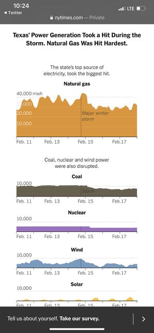
| − | + | On the Left is a a diagram from the New York Times. Looking at it, you conclude that natural gas was totally dominant in Texas electricity generation, and after a big snow storm, it declined some. Wind went down too, but it didn't really matter much to begin with. | |
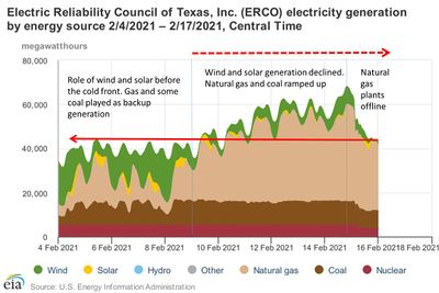
| − | + | That's a lie. The diagram may well be truthful in every detail, but it is a lie, because it is carefully designed to deceive you. Take a look a the figure ot the right. It starts during the normal winter period from February 4 to February 9, and compares that with what happened when the cold front moved in February 9 to February 16. As you can see, before February 9, wind power was roughly equal to gas power in importance-- sometimes bigger, sometimes smaller. Then wind power collapsed. Gas generation went way way up, to 200-300% of its old level, and total power generated went up, because people wanted a lot more of it to heat their homes during the cold period. In the last day or two, natural gas generation went down, to just about 200% of its original level instead of 300%, and that meant total generation went down to where it was normally. | |
| + | The New York Times starts its graph on February 11, after wind power had already collapsed. Thus, it looks unimportant and it doesn't fall a lot-- it is already so low it can't fall much more. And its graph starts after gas power had already more than doubled--- so it had nowhere to go but down. They put a line in for "major winter storm" on February 14, but whatever that is, it isn't the big weather event, which was the cold front on February 9 | ||
| + | |||
| + | This is an excellent example of how the New York Times constantly lies while telling the truth. Usually it does this in words rather than in a graph, but the method is the same: say facts that are true, but leave out the most important facts and emphasize trivial events that are taken out of context. | ||
| + | |||
| + | ----- | ||
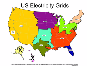
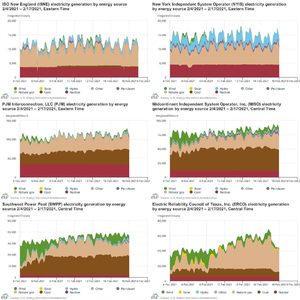
| + | The next diagrams show what happened in different regions around the country. I know the right-hand-one is tiny: you may have to do right-click save image as temp.png, then click on it at the bottom of your browser to bring it up so you zoom in on it. | ||
| + | |||
| + | [[File:Temp.png|thumb|left|Electricity Grids in the United States]] | ||
| + | [[File:Temp1czzxc.png|thumb|right|Electricity Generation by Source in Different Grids]] | ||
----- | ----- | ||
Latest revision as of 08:51, 22 February 2021
On the Left is a a diagram from the New York Times. Looking at it, you conclude that natural gas was totally dominant in Texas electricity generation, and after a big snow storm, it declined some. Wind went down too, but it didn't really matter much to begin with.
That's a lie. The diagram may well be truthful in every detail, but it is a lie, because it is carefully designed to deceive you. Take a look a the figure ot the right. It starts during the normal winter period from February 4 to February 9, and compares that with what happened when the cold front moved in February 9 to February 16. As you can see, before February 9, wind power was roughly equal to gas power in importance-- sometimes bigger, sometimes smaller. Then wind power collapsed. Gas generation went way way up, to 200-300% of its old level, and total power generated went up, because people wanted a lot more of it to heat their homes during the cold period. In the last day or two, natural gas generation went down, to just about 200% of its original level instead of 300%, and that meant total generation went down to where it was normally.
The New York Times starts its graph on February 11, after wind power had already collapsed. Thus, it looks unimportant and it doesn't fall a lot-- it is already so low it can't fall much more. And its graph starts after gas power had already more than doubled--- so it had nowhere to go but down. They put a line in for "major winter storm" on February 14, but whatever that is, it isn't the big weather event, which was the cold front on February 9
This is an excellent example of how the New York Times constantly lies while telling the truth. Usually it does this in words rather than in a graph, but the method is the same: say facts that are true, but leave out the most important facts and emphasize trivial events that are taken out of context.
The next diagrams show what happened in different regions around the country. I know the right-hand-one is tiny: you may have to do right-click save image as temp.png, then click on it at the bottom of your browser to bring it up so you zoom in on it.


